Luxen Fleur
Challenge
Luxen Fleur is an upscale floral company. Their aesthetic was similar to their competitors. Their style was luxurious with gold, black, and white marble. They want to stand out from the rest of the market with a new look and feel.

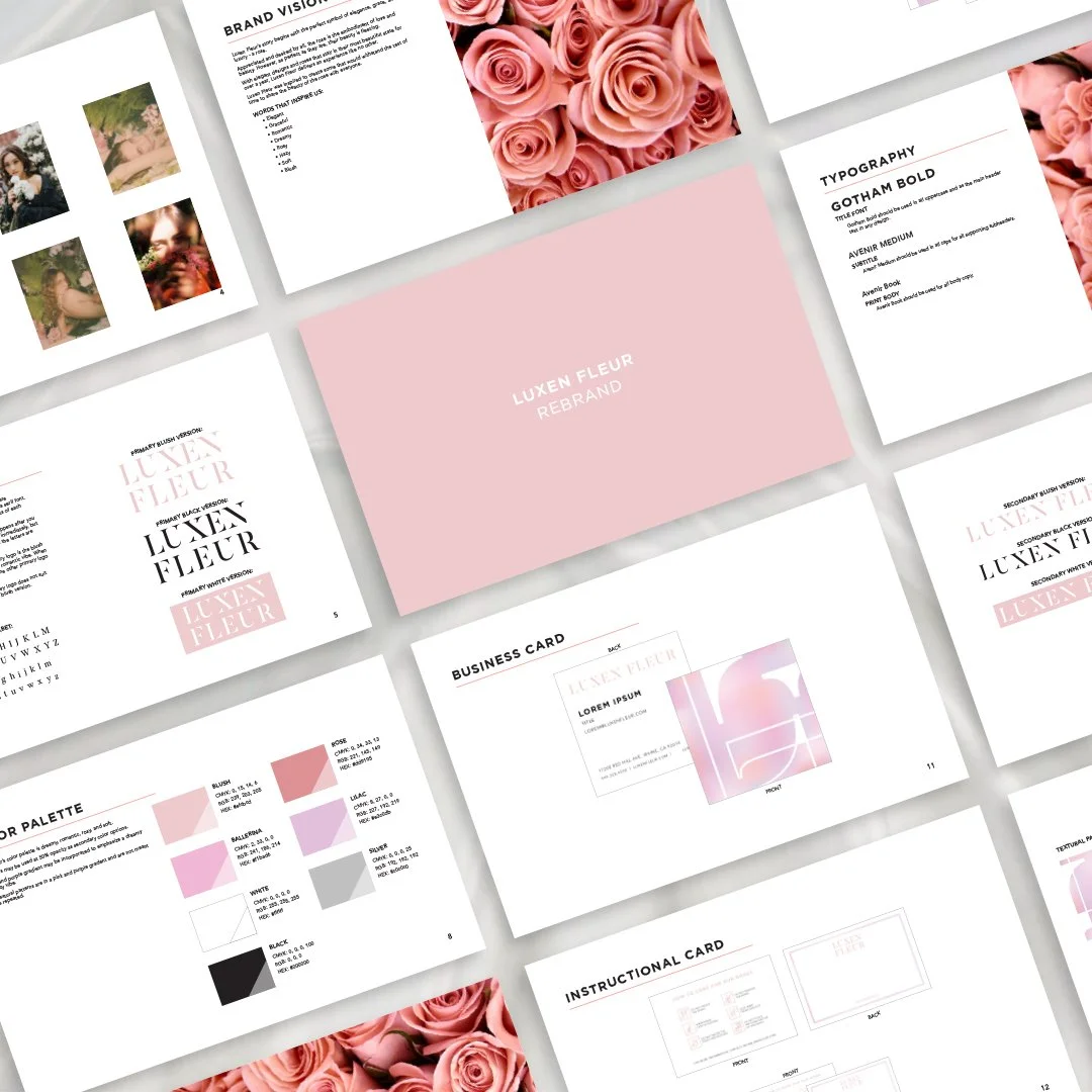
Old brand guidelines

Old logo on black box product
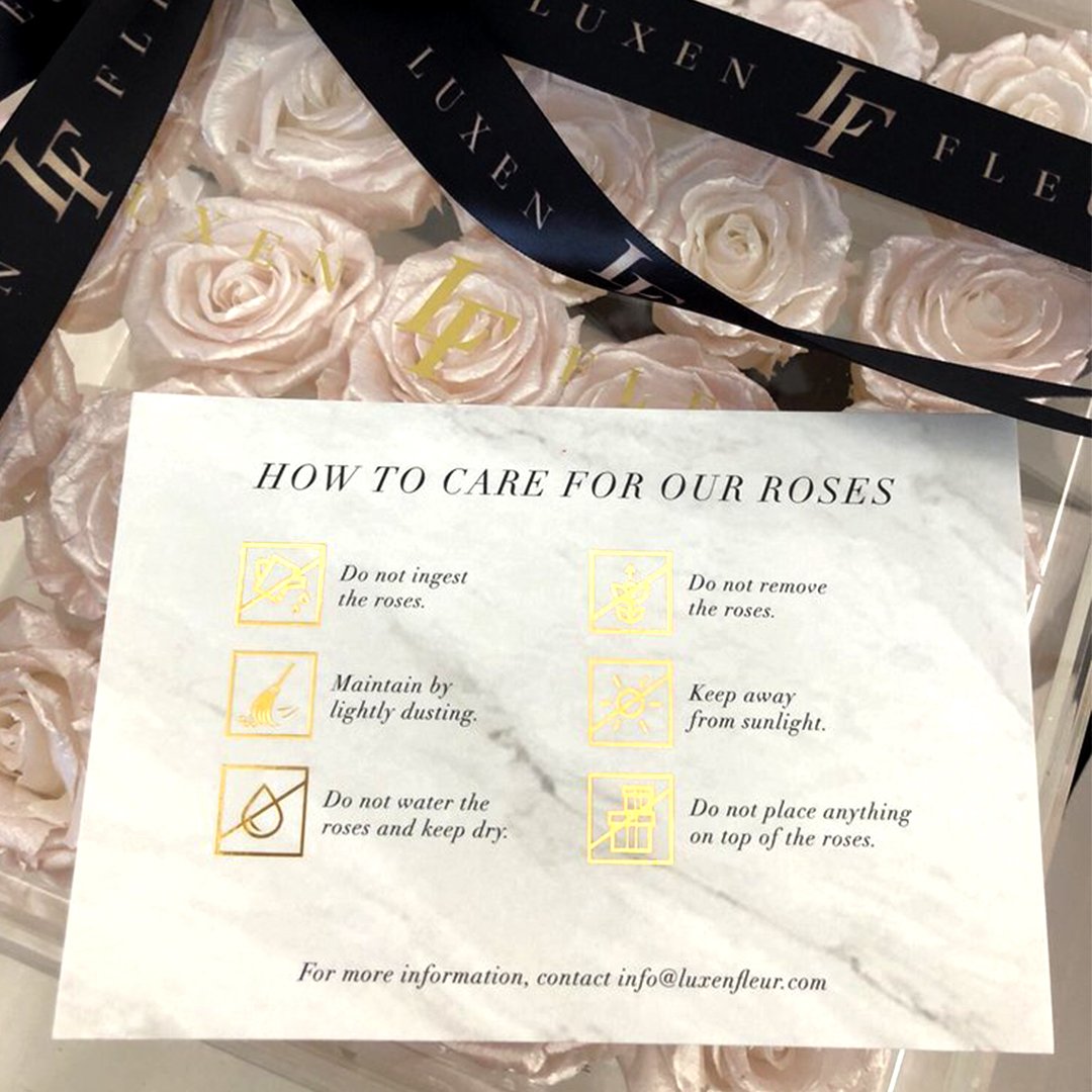
Old instructional how-to-care card on top of product
Solution
The design solution is a rebrand with a romantic, dreamy, soft aesthetic. The art direction was given by Brittney Au. The new design assets include a logo, color palette, business card, greeting card, instructional card, and social media posts. The logo consists of fragments of letters that are missing. The missing letters represent what happens when one wakes up from a dream. Most people immediately forget their dreams, but some remember bits and pieces. Even though pieces of the letters are missing, you still know what each letter is.
New brand guidelines
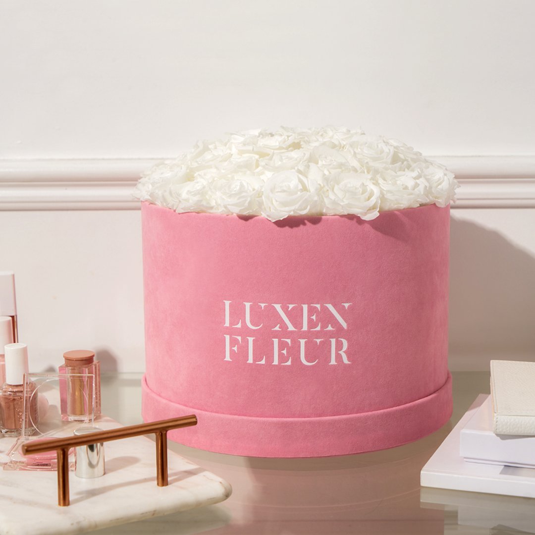
Logo on pink velvet box product

Primary and secondary logos
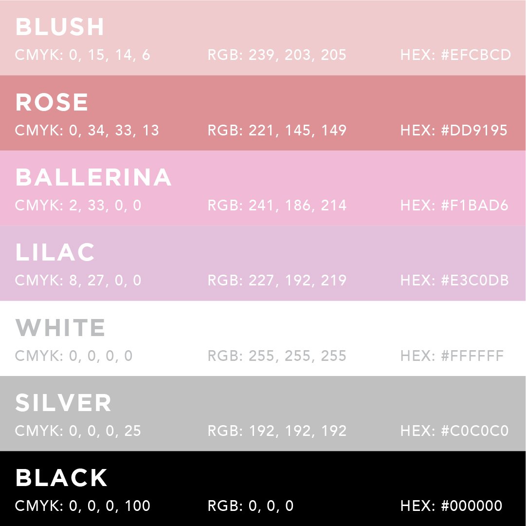
Color palette

Business card

Instructional how-to-care card

Greeting card

Valentine's Day countdown animated Instagram story post